POINT A: The Client's Initial Situation
The client faced a number of issues with their website:
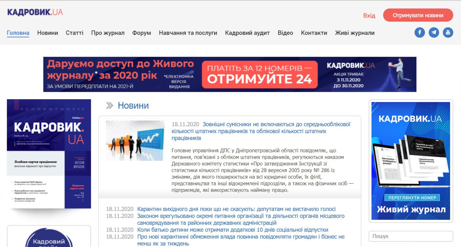
Confusing design and information overload made the site difficult to navigate. The new target audience couldn’t easily understand what the site was selling, and it wasn’t memorable (the only thing distinguishing it from competitors was its blue color).
Users were leaving the site to visit another company resource – an online store, which complicated the customer journey and led to potential clients getting "lost" along the way.
Complicated registration process and lack of clear incentives for the target audience to purchase a subscription. The absence of a unique selling proposition (USP) and brand packaging made it hard to stand out in the highly competitive info-business market, despite the product’s high level of expertise.
Outdated site structure that was heavily dependent on programmers, making it inconvenient for the editorial team to use As a result, the website wasn’t working as a sales tool, serving instead as an online platform that simply supported the editorial team’s activities.
One of the client’s main goals was to convert their customer base to online subscriptions and to sell seminars, webinars, consultations, and other services offered by the company.
This is what the website looked like before working with us

POINT B: Digital Transformation – What We Did for the Client
1. Conducted a marketing research to gain a deeper understanding of the client's business. We identified priority products for sales, analyzed the customer journey, studied prices and competitors’ offerings, pinpointed the target audience’s "pain points" and developed ways to address them. We were inspired by the client’s product and worked together with their team to re-evaluate the entire marketing strategy for the relaunch of online sales.
2.Created a comprehensive “packaging” for the website. Developed a new design that included:
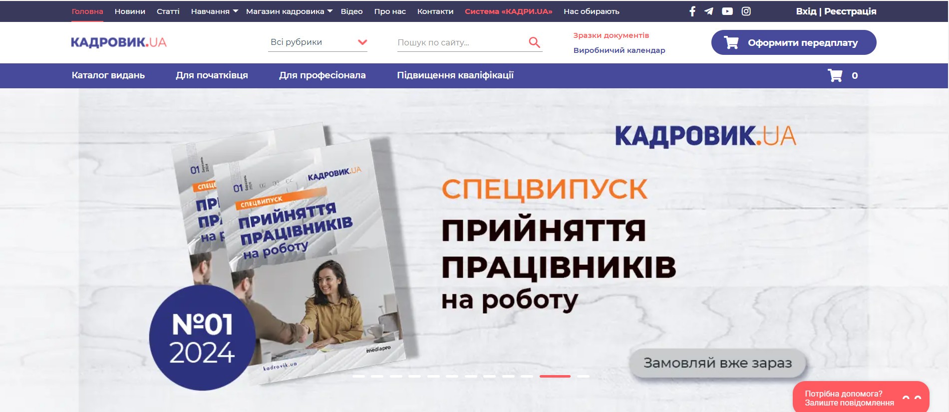
1) Adding essential tools and search functionality to the header, refining the USP, and presenting all product benefits in a comparison table. We organized the client’s information products and prioritized them for better presentation.
2) Improved the readability of the site by removing unnecessary elements, simplifying information, enhancing usability, adding engagement blocks and sales-oriented screens, providing demo access to introduce users to the client’s core product, implementing promotional offers, and visualizing the client’s key services.
This is how the homepage looked after our work:

3) Consolidated online store sales within a single resource to boost overall sales volumes.
3. Developed a landing page for selling online courses based on marketing insights.
4. Built a website with full online store functionality, simplifying the purchasing process and improving the customer journey.
5. Set up targeted advertising on Facebook and Instagram. We also implemented professional SEO and provided support for contextual advertising.
6. After the marketing analysis, the client also ordered an additional landing page – distance.kadrovik.ua.
Point C: Result
1) The campaign was initially planned for two months, but the number of leads, their cost, and the conversion rate exceeded expectations, doubling the projected outcomes.
2) The online store turnover is expected to increase by 2-6 times due to effective marketing-driven information presentation, impactful advertising, enhanced website usability, and a streamlined customer journey to purchase.
3) The site is now functioning as a powerful sales tool. Sales growth by the end of 2021 reached 350%.
